Under the Screen Pop Art Secrets Quiz Pro Mode
Quiz Complete!
Pop Art’s Backstage: How Bold Images Were Made, Sold, and Multiplied
Pop Art can look like it sprang fully formed from a comic strip or a supermarket shelf, but much of its power comes from what happened offstage: the tools, labor, and business choices that turned everyday imagery into art you could recognize from across a room. The movement’s signature clarity was rarely effortless. It was engineered through commercial techniques, careful planning, and sometimes a bit of chaos that artists learned to embrace.
A key engine behind Pop was screenprinting, a method long used for posters and product graphics. Instead of painting every color by hand, an artist could separate an image into layers and push ink through a mesh screen onto paper or canvas, one color at a time. This encouraged flat, punchy color and sharp edges, and it also made repetition practical. But repetition did not mean identical. Slight shifts in registration, the alignment of one color layer to the next, could create halos, shadows, or jittery outlines. What a commercial printer might call a flaw could become a deliberate sign of energy and modernity. Artists learned that a small misalignment could make an image feel more alive, like it was vibrating with mass media noise.
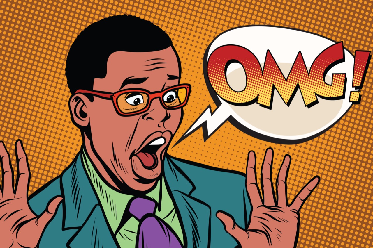
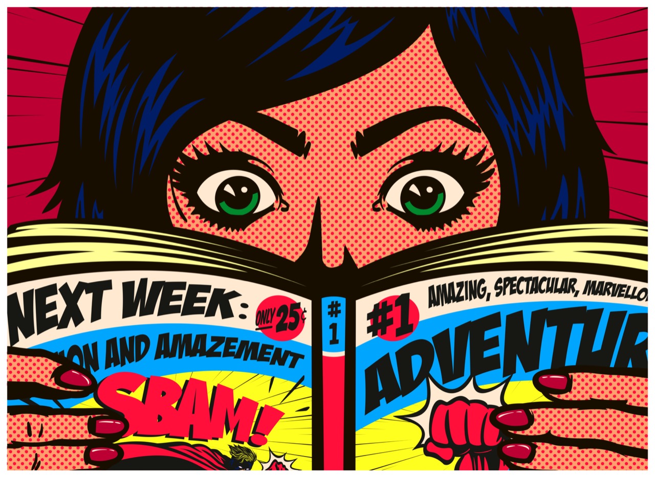
Those dots you associate with comic printing have their own backstage story. Ben-Day dots, named after illustrator and printer Benjamin Day, were a cost-saving way to create shading and color effects with tiny dots. Roy Lichtenstein famously magnified this look until it became the subject rather than the hidden mechanism. The irony is that the original dots were meant to disappear into a smooth image at normal viewing distance. Pop Art brought them forward, making the printing process impossible to ignore.
The “factory” model also shaped Pop’s output. Some artists ran studios that resembled small production houses, with assistants preparing screens, mixing inks, pulling prints, stretching canvases, or handling paperwork. This wasn’t simply about speed. It mirrored the industrial and commercial world Pop was commenting on. It also raised lasting questions about authorship. If an assistant pulls the squeegee, who made the work? Many Pop artists treated the idea, the selection of the image, and the approval of the final result as the core creative act, while the labor could be delegated like in advertising or publishing.
Editioning is another behind-the-scenes mechanic that changed how Pop circulated. Prints are often sold in numbered editions, such as 50 or 250, sometimes with a few artist proofs set aside. The edition size affects scarcity, pricing, and prestige. Pop artists and their dealers understood that controlling editions could create a market while still allowing the image to spread. Paradoxically, an artwork could be “mass-produced” and still carefully rationed.
Then there is the complicated world of licensing and lawsuits. Pop drew heavily from photographs, comic panels, and brand imagery. Sometimes artists asked permission; often they didn’t. In the early days, the boundaries between homage, appropriation, and infringement were murky, and the law has continued to evolve. These disputes reveal how Pop sits at the intersection of art and commerce: it critiques advertising while borrowing its language, and it depends on recognizable images while challenging who owns them.
Materials mattered too. Acrylic paints, commercial enamels, pre-primed canvases, and industrial pigments helped achieve that clean, modern surface. Some artists preferred the look of mechanical perfection, while others liked the tension between slick color and human touch. Even choices like glossy versus matte ink could change the emotional temperature of an image, making it feel like a billboard, a magazine page, or a treasured icon.
Pop Art’s secrets are not just trivia; they explain why the work still feels current. The movement anticipated a world where images are endlessly replicated, slightly altered, and rapidly distributed. Behind every bold face and bright can is a chain of decisions about process, labor, and ownership, and that backstage drama is part of what makes Pop more than just a catchy look.